Some years later, I am at the same spot: trying to get proper font rendering for ubuntu, this time 16.04. After some research, these are my findings:
- Ubuntu Tweak is where one can set the fonts for Unity - this affects most menus, and some of the apps
- Other apps, especially firefox and thunderbird, don't respect this setting. They respect fontconfig though - so one has to configure both.
- fontconfig is configured in /etc/fonts/conf.d, and also in
~/.config/fontconfig/fonts.conf. A good resource to understand this is
https://wiki.archlinux.org/index.php/font_configuration
one can check what fontconfig will match for a given font name by: fc-match fontname - Firefox and thunderbird might update their rendering after fontconfig has rescanned the configuration. This might happen, but to be sure, better restart them.
- Firefox and thunderbird have font settings for each encoding. So one has to set proper values for 'latin' and 'other writing systems' which is their acronym for utf-8.
I like my fonts to be crisp, like in the screenshots below, and I don't care too much about the actual font shape. I don't use MacOS (or whatever OSX is called these days) :-).
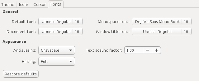
So, In Ubuntu Tweak I selected the following settings:
Before configuring fontconfig one has to understand the problem of Helvetica. Lots of websites want it, but Ubuntu delivers a really unsuitable replacement. Thats why lots of websites look ugly, unless a better alternative is configured. I like to use Arial as a replacement, but DejaVu Sans would do as well.
To get Arial I have to install it. In 16.04 there is a bug though, but loading the upgrade debian package helps:
wget http://ftp.de.debian.org/debian/pool/contrib/m/msttcorefonts/ttf-mscorefonts-installer_3.6_all.deb
sudo dpkg -i ttf-mscorefonts-installer_3.6_all.deb
This leaves my fontconfig file in ~/.config/fontconfig/fonts.conf
<fontconfig>
 <match target="font" >
 <edit name="rgba" mode="assign"><const>none</const></edit>
 <!-- <edit name="lcdfilter" mode="assign"><const>lcddefault</const></edit> -->
 <edit name="hinting" mode="assign"><bool>true</bool></edit>
 <edit name="antialias" mode="assign"><bool>true</bool></edit>
 <edit name="autohint" mode="assign"><bool>false</bool></edit>
 <edit mode="assign" name="hintstyle"><const>hintfull</const></edit>
 </match>
 <match target="pattern">
 <test qual="any" name="family"><string>Helvetica</string></test>
 <edit name="family" mode="assign" binding="same"><string>Arial</string></edit>
 </match>
 <!-- <rescan><int>5</int></rescan> -->
</fontconfig>
In Firefox I have the following font settings (remember: latin and other writing systems):
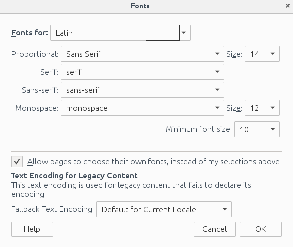
Update: I use 16 now instead of 14.
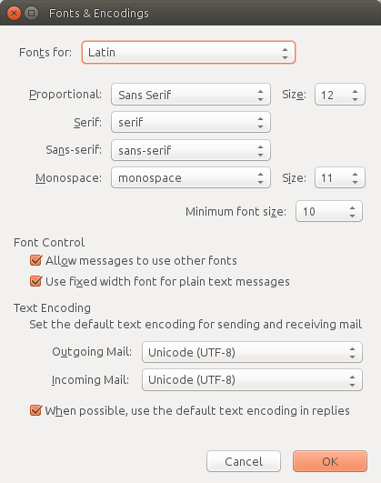
In thunderbird (latin and other writing systems):
Last there are the qt based apps. like skype, where the font is a bit to small for me. So I used qtconfig from qt4-qtconfig, changed appearance to another style, saved, changed back to Desktop Settings (Default), saved again. and now it looks good.
Last note: I tried using Helvetica and Helvetica Neue from MacOS, but they don't render nicely with hinting set to 'full'. If hinting is set to 'slight', using the MacOS creates a nice visual experience (but as I said, I need crisp fonts)